|
This logo design summative, is our final project for the year, looking back technology has been a sophisticated class, but it was very fun, for our final project, we were asked to make a logo based on whatever we wanted, so I made it about planets, I use the ellipse tool, the pen tool, and the color tool, the most frustrating tool was trying to get the rings around the planet to match up, it was very annoying, I just used a line, and made them match up, so it turned out to be much better than expected, I really liked all threee of the logos. 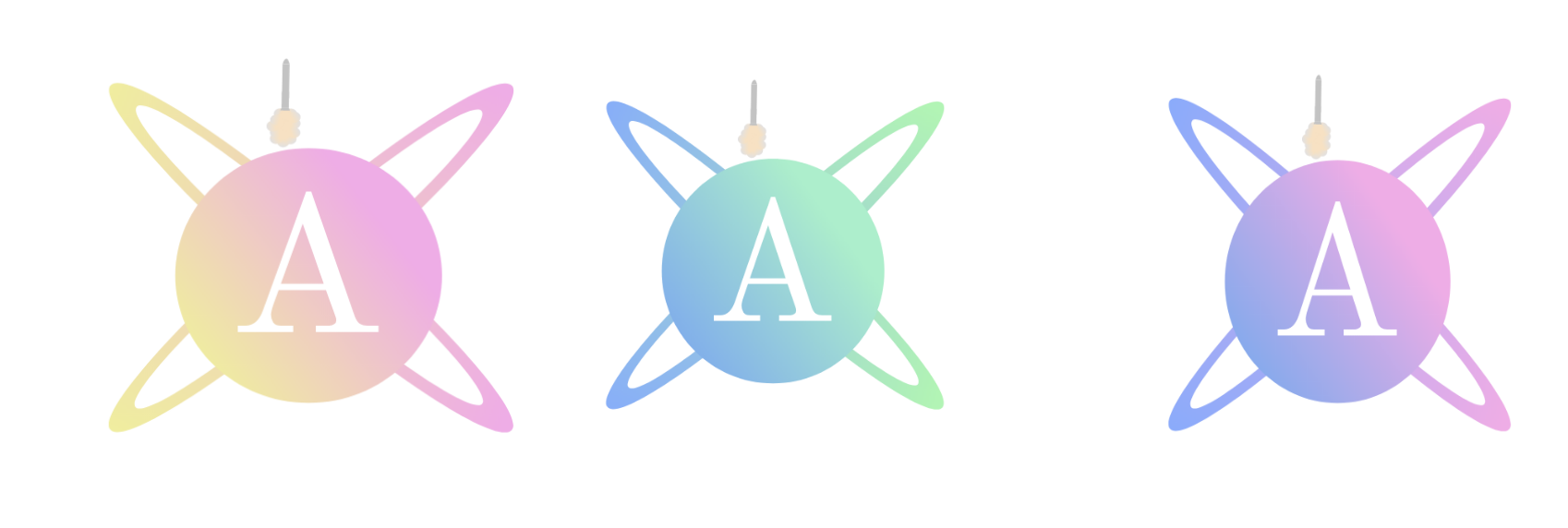 Aviation Industries is the newest top of the line space traveler, giving you the best prices! we chose Alper Teymurlu as our logo designer, because we saw his portofolio, and saw that he loved making designs related to space, so we asked him to make a planet, and add an A, he went above and beyond, and added more elements than expected, I personally love the green and blue planet, because it resembles earth the most, I believe that we will definitely hire Alper Teymurlu for another project, it's a new electeic car idea that we have, and we would love to see it made. 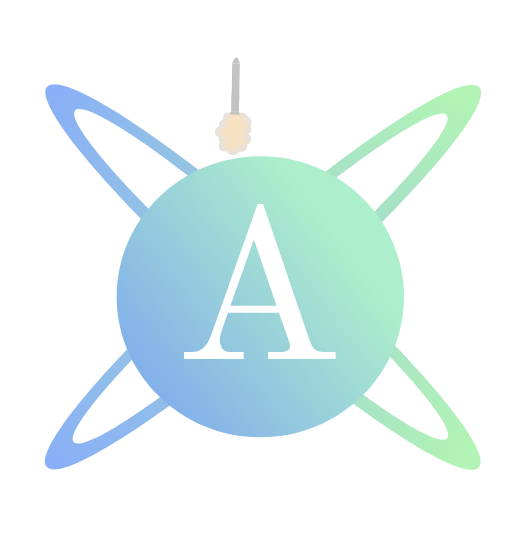
2 Comments
I learned about color schemes, and how colors can effect how someone percieves something, hex codes is a new thing that I was introduced to, it's how bright the pixels are on you're screen, the screen has tiny pixels which are small lights, the color is ussually sorted as (X,X,X) Red Green Blue and that determines the color, we were asked to make a gravit design with the hex color of each of the color names, it was very difficult to fit every text box in, but it looks clean, I also made another document named the color schemes, I made a good portrait with the hex codes, and I used Adobe color to make a, Analgous, Monochramatic, Complimentary, and Triadic color scheme, these colors go well with eachother. Color Names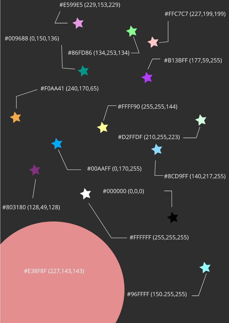 I made a portrait of the stars, and used the hex codes, and also the hexadecimal code, this makes sure that someone can replicate this color with no differences, the two will look identical, this portrait can easily be recreated, I used the shapes tool, and also the lines tool, and text tools, this is very easy to recreated, and didn't take too long. Color Schemes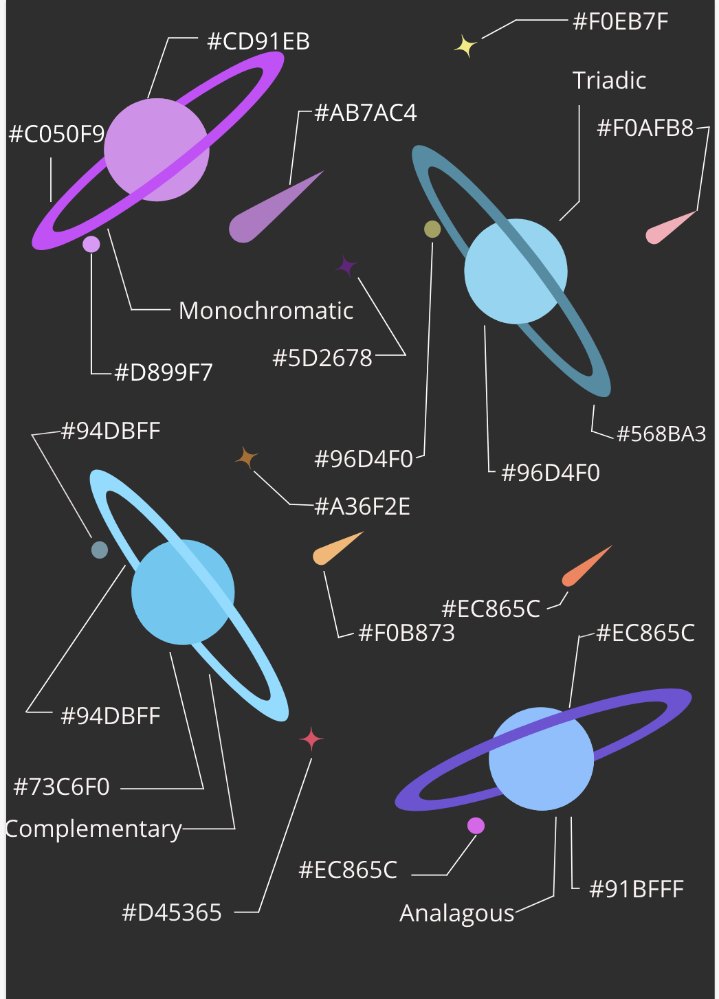 Color schemes is color's that compliment eachother, this was the most fun assignment, but the main challenge I faced with this was fitting in the lines, and text boxes, sometimes it looks weird, but it works, I used the color fill tool, shape tool, and clipping tool, I did alot of this work earlier, but sometiems I did that was new was making the ring hide behind the other ring behind it.
Typography is the look of a font, and it effects how we see font's I think that the quote Each font has a quality and purpose, means that how you look at a font will interpret how you see a story, there are 5 differnet types of fonts, there is serif, sans serif, monospace, hand written, and display fonts, serif fonts have little feet on them, and sa ns serif font's are clean and sleek, and look good, monospace adds a certain amount of spacing between each letter, handwritten fonts look handwritten, and display font's look cool, but arent the best to read Serif could be used in a letter sans serif could be used for a essay, monospace could be used for coding, hand written could be used for sending letters, display font's could be used for children in a presentation, because this grabs there attention Type face comparsionThe typeface comparison activity made me use font's, and use a professional formatting to make the text easier to read while also making it look better, this can be used in presentations, and also in letter, where a reader starts reading is detrimental to how they see a text, having Emphasis makes you're text Pop! while also making the reader know where to start. 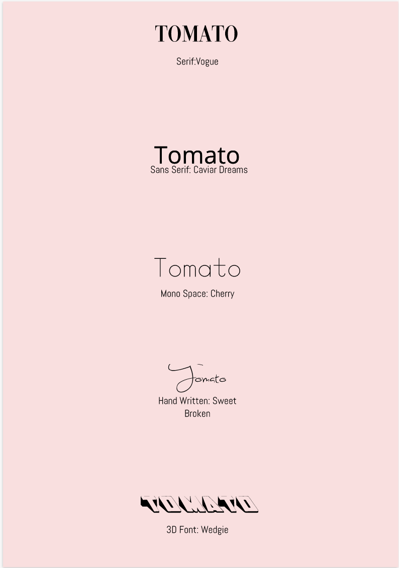 Word PortraitsA word portrait helps make you're writing nice and clean, this can be in the form of many fonts, but usually when you have a dark and scary story, you won't be using a nice and BoUnCy text, instead you would use a text maybe made of ink, and one that looks as if it was written in a hurry. 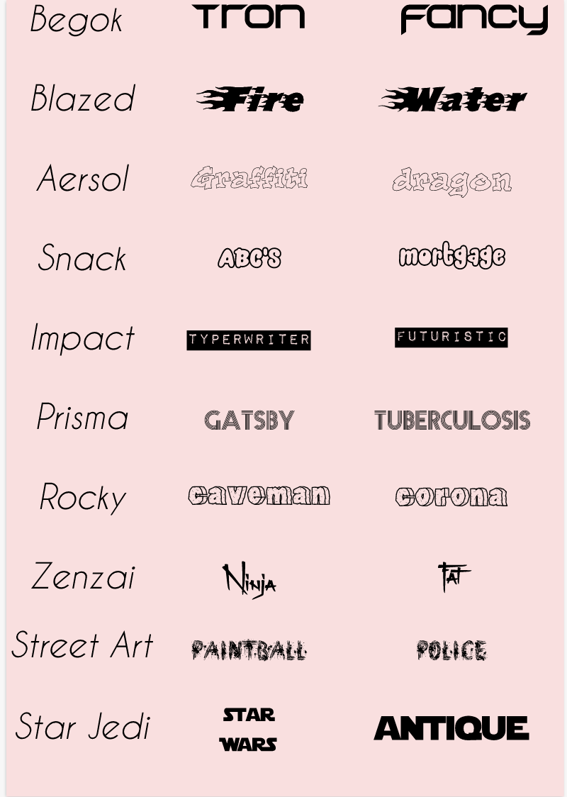 Today I made a monkey in space chasing after a bannana, this is inspired by the painting creation of adam, and I think it just speaks for itself. I got the inspiration for this, because I like monkey's alot, especially the siamang ape, which makes a really cool noise, and personally I think it's the most intresting monkey there is, and it looks really cool when it makes the special noise, if you are really intrested here is a video of the ape. https And all sources are here: Monkey,Banana,Space,Dole Sticker,Flip Flops The pent oll is a toool which uses 2 points or more to create a line, you can hold and drag to make this line curved, and pressing option while dragging will make another line. I came across no challenges while making this. There are 3 images here, the first is the summative obviously, the next is a superhero exercise which was probably the most difficult, but not impossible, and the last is the penny, the penny was personally the easiest for me, and I thought the spiderman cut out was harder than it, but the project took the most time, because there are many images in there. 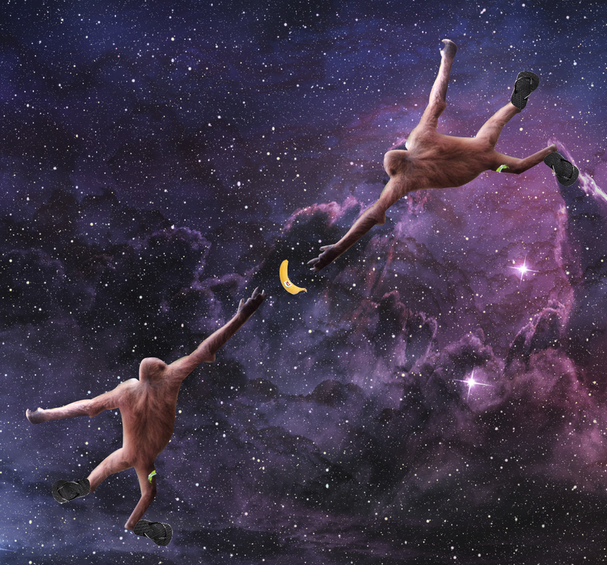 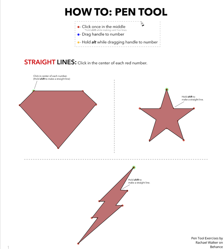 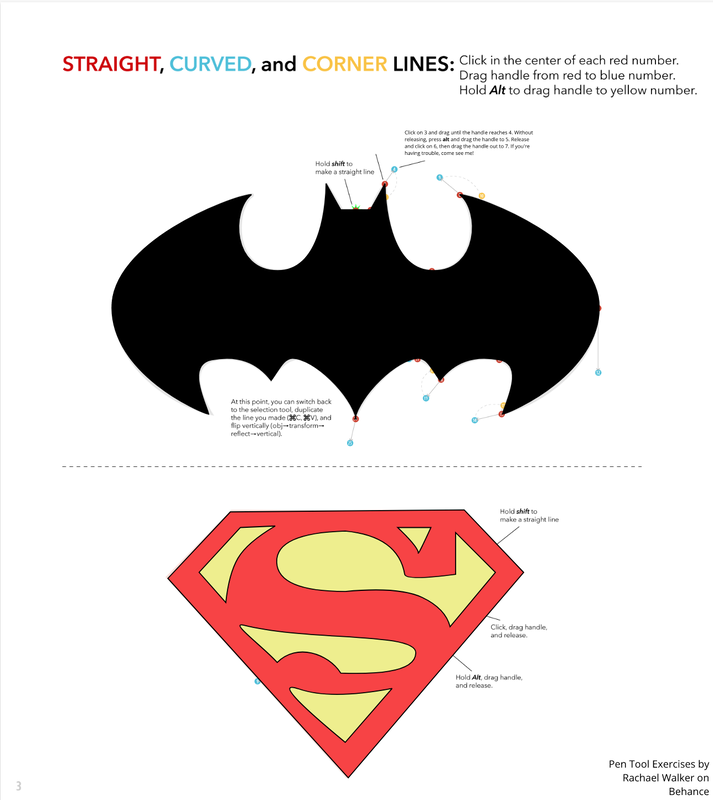  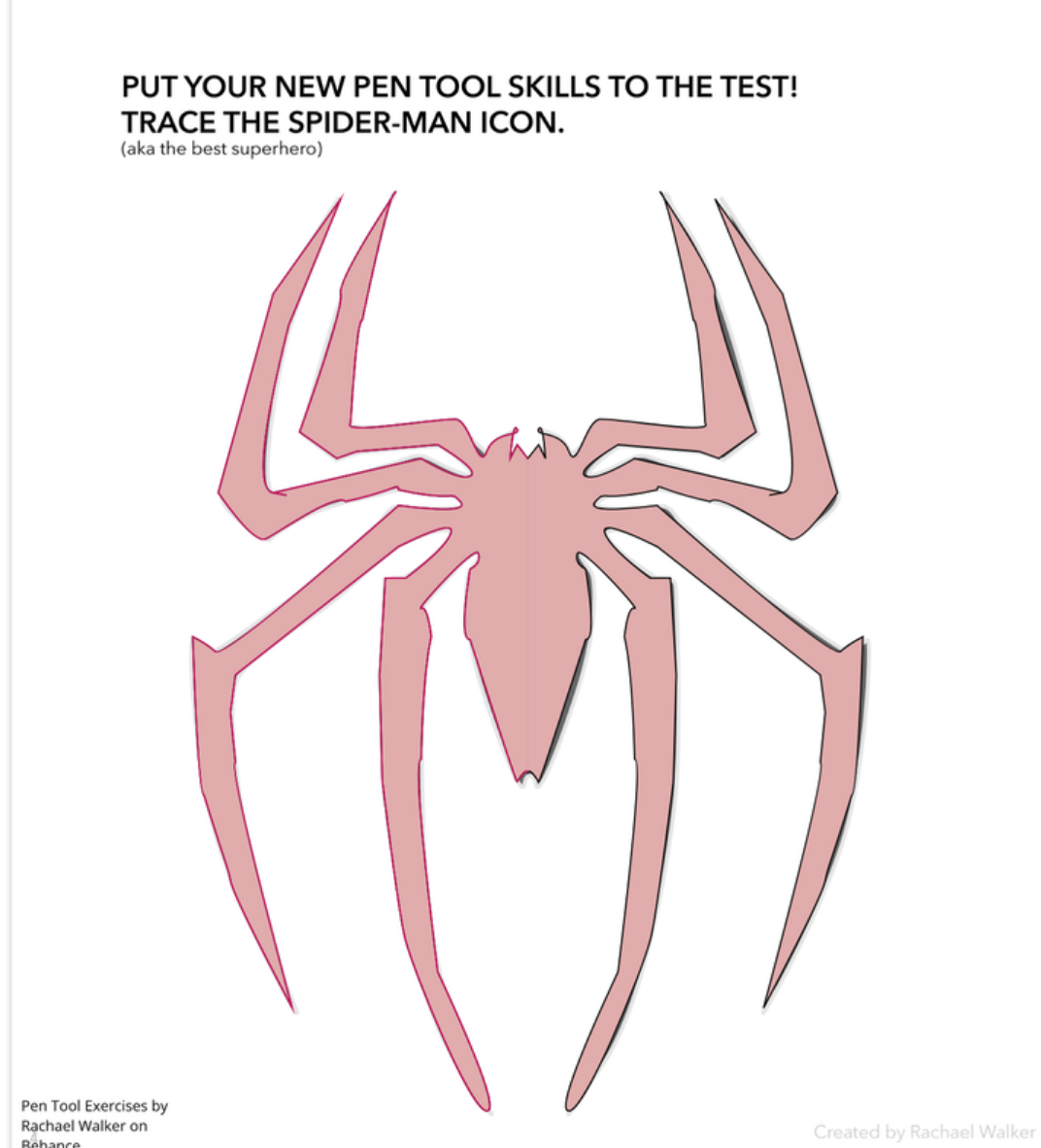 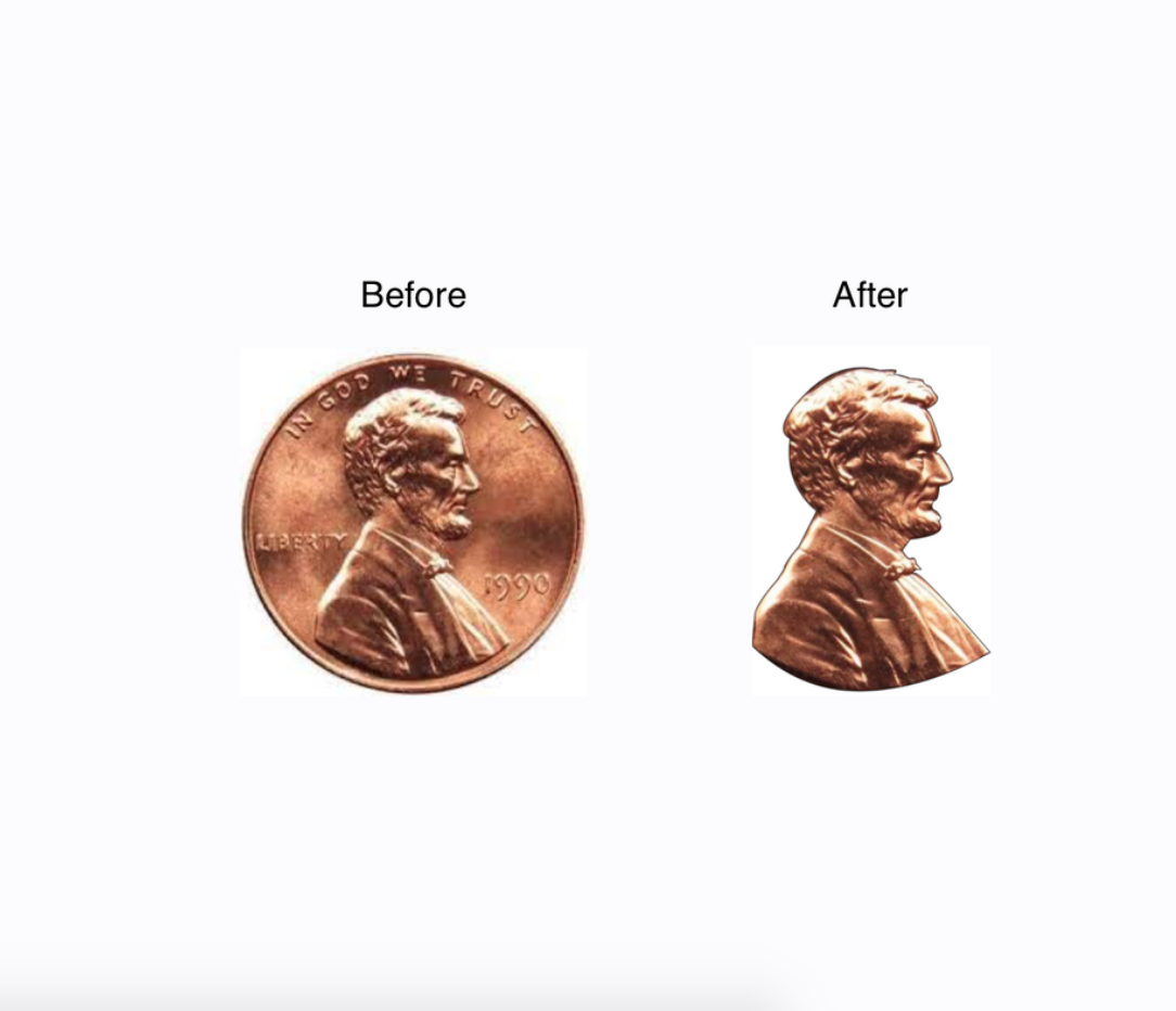 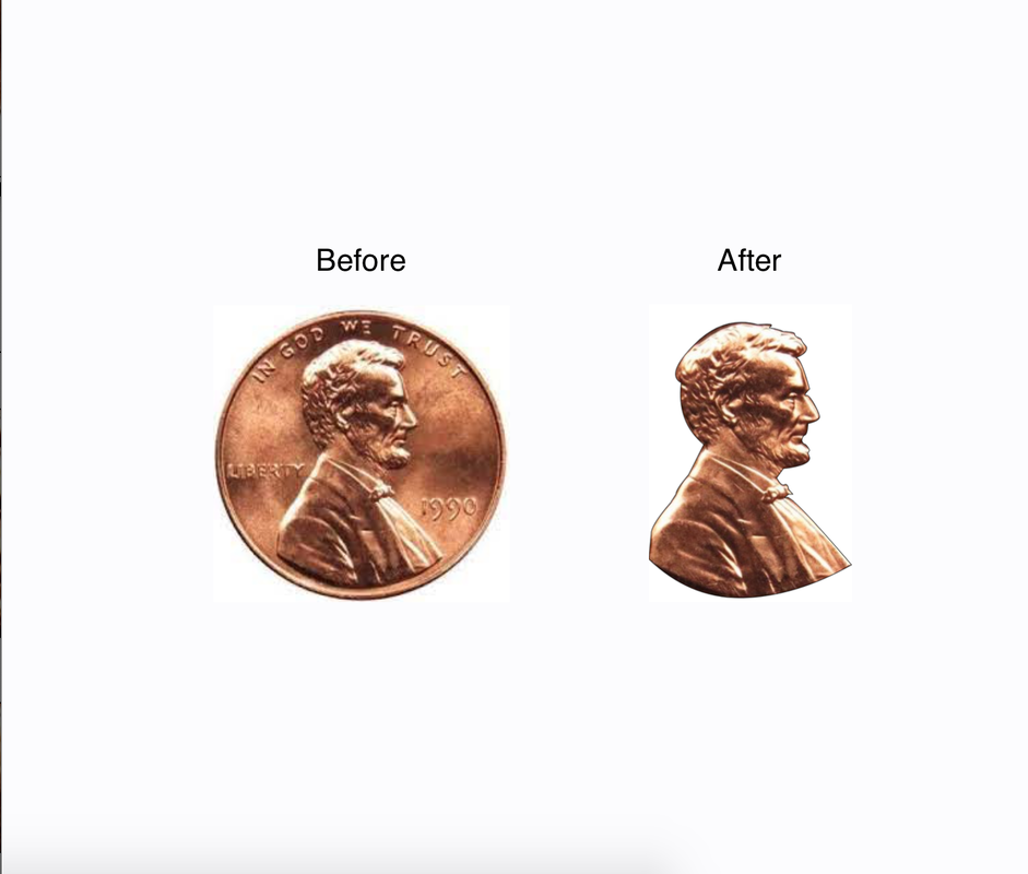 Today I learned how to use the pen tool to make this cut out of a penny, it looks really cool, but I think that photoshop could do the same if not better.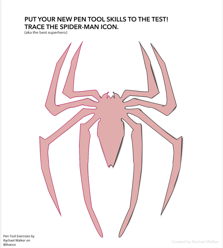 Today I learned how to use the pen tool to make this really cool spider-man, it was no easy task, but once I got the hang of using the tool it became more and more simpler.
In the past few days, I have been making a project, this project consisted of only 6 shapes, but I could use the rest of the tools, and I really had to think about what was meaningfull to me, and I liked space, so I decided that would be the theme for this project, I worked really hard to make this as aesthetically pleasing as possible, and I believe that it's the best that I can do. 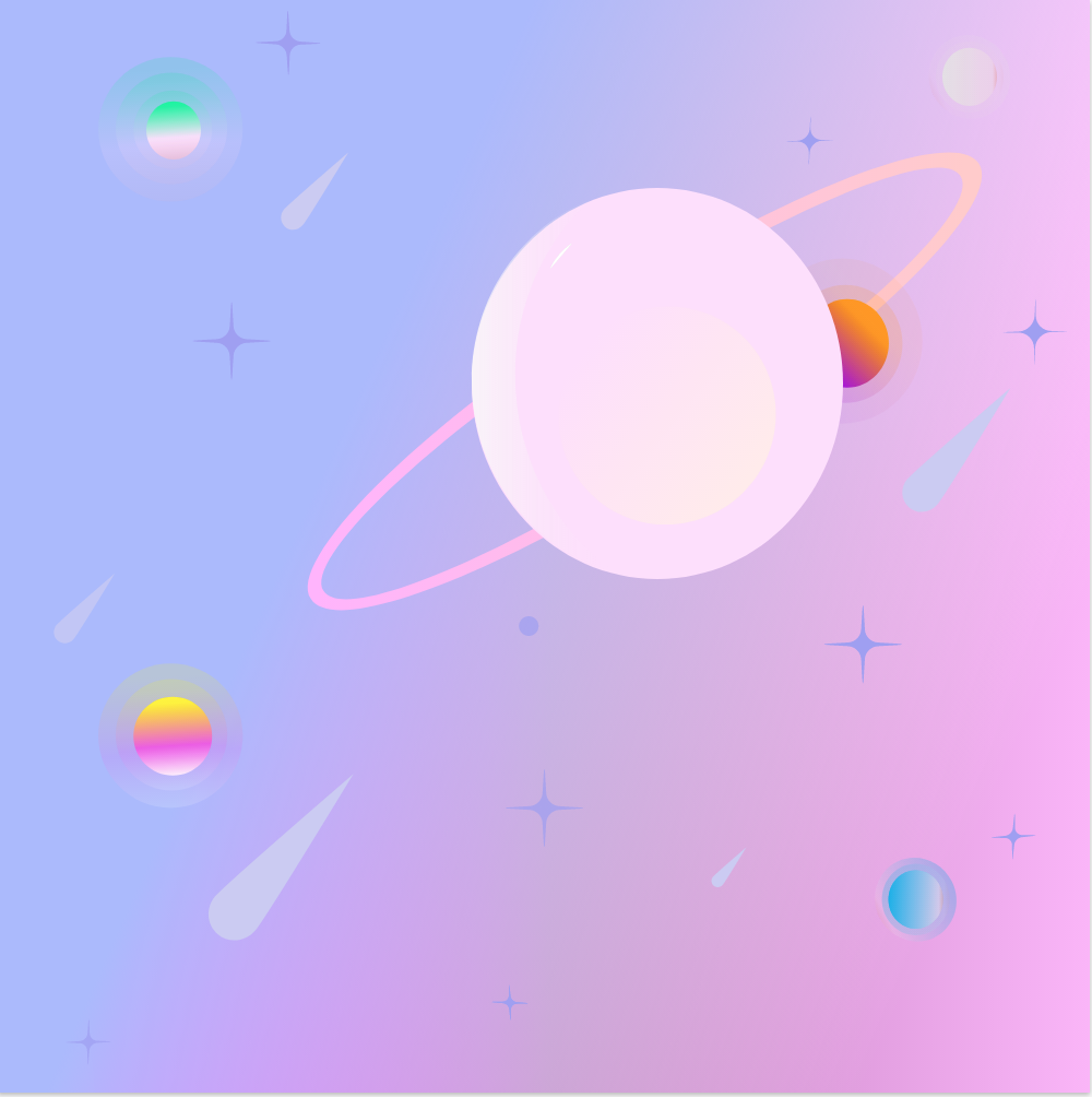 Today I learnt how to modify shapes, and also use some cool tricks, to make things overlap, and find the difference, and it also allowed me to make really bubbly shapes, I like the bubbly shapes, since they were too aggravating towards the eyes, they were really restful, I may use gravit for bubblyshapes when I need them. 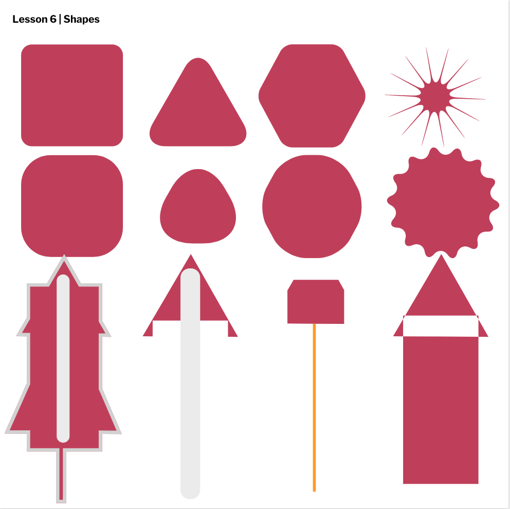 Today I learned how to use gravit to align shapes, and make them look cool, I found out about this cool feature, which made them all stack ontop of each other, but they were a bit off, and it looks like a snake this is really cool!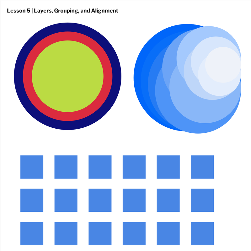 Today I learned how to use borders to make my shapes fancy this was pretty fun to do. 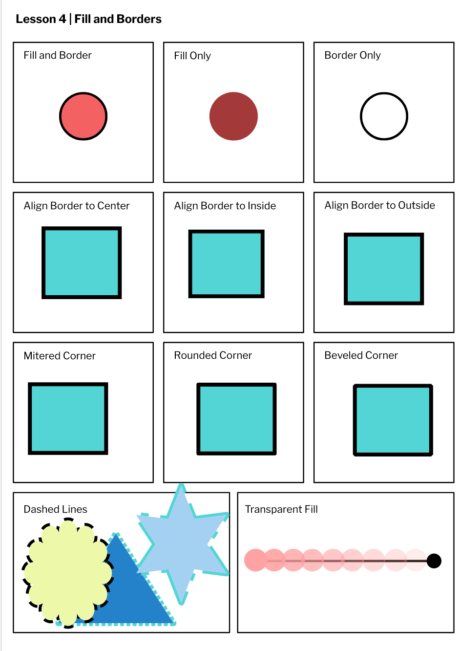 |
AuthorI like sleep. Archives
May 2021
Categories |
 RSS Feed
Photos used under Creative Commons from wuestenigel, Carmine.shot
